Word Spacing
It may sound funny to pay special attention to the word space; however, it is one of the most commonly used parts of a type design.
A word space that is too wide or too narrow can ruin the design of a font. It’s not too early to begin considering the word spacing as long as you have your first characters set up. The choice you make at this point should be gradually adjusted while you progress in the design of the font.
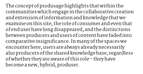
The word space here is too tight…

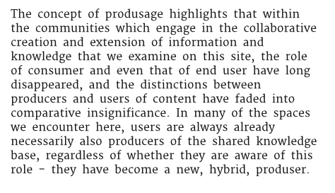
And here, it’s too wide…

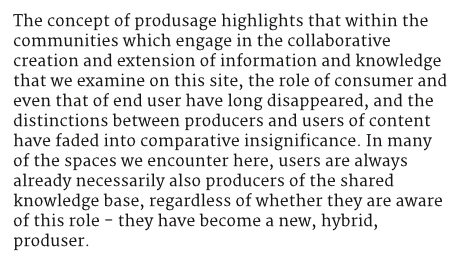
Now this is well-balanced…

If your type is meant to be used at larger sizes, then the word space can be reduced — and vice-versa if it’s to be used at very small sizes.
The research has shown that a word space that’s too large is more tolerable than one that’s too small, so if you are unsure you may want to err in that direction.
Note: Similar studies have shown that younger children in particular benefit a little from word spaces larger than what’s considered normal for adult readers.
Linda Reynolds and Sue Walker (2004) — ‘You can’t see what the words say: word spacing and letter spacing in children’s reading books’, Journal of Research in Reading, vol 27, no.1, pp. 87-98.