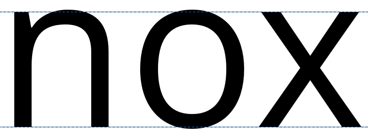
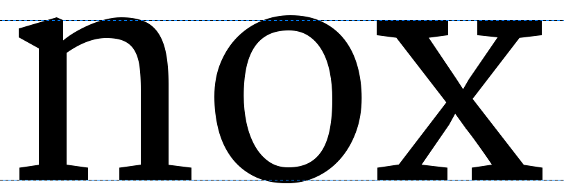
Creating ‘o’ and ‘n’
There are many approaches to designing a font. It can be helpful to deconstruct the larger processes involved in order to get started quickly, and to provide a solid basis for a whole font’s worth of characters. A popular and valuable approach to this is to design the ‘o’ and ‘n’ characters first, nailing down essential elements of form, space and balance, before bringing them together for the formation of other characters. Creating the lowercase ‘o’ and ‘n’ characters can provide us with some of the fundamental forms and structures that will underpin all other characters that are needed.
Although the design of the ‘o’ may seem like quite a simple thing, all the characteristics mentioned in the “What is a font?” chapter come into play. The choice you make about each characteristic should be a deliberate choice.
Underhangs and Overshoots
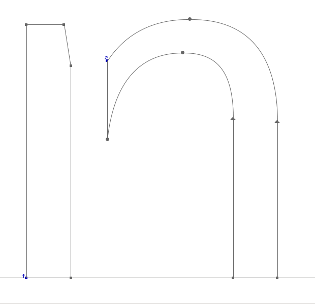
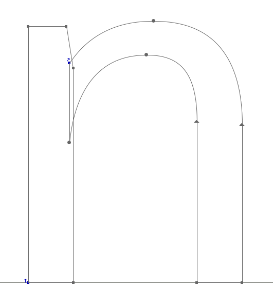
One way in which optical effects impact type design is in how curves and straight edges appear to the eye. For instance, for a curve and a straight edge to look as though they are aligning correctly on the baseline, the curve must actually sit a little below the line, producing an undershoot. The portion of the character that dips just below the baseline in order to appear sitting on the baseline is called the underhang — demonstrated below. Without underhang, characters with curves around the baseline will appear misaligned within a line of text.
Similarly to the undershoot, an area of overshoot is needed to provide the illusion of alignment at the X-height and at the Cap-height (see below).
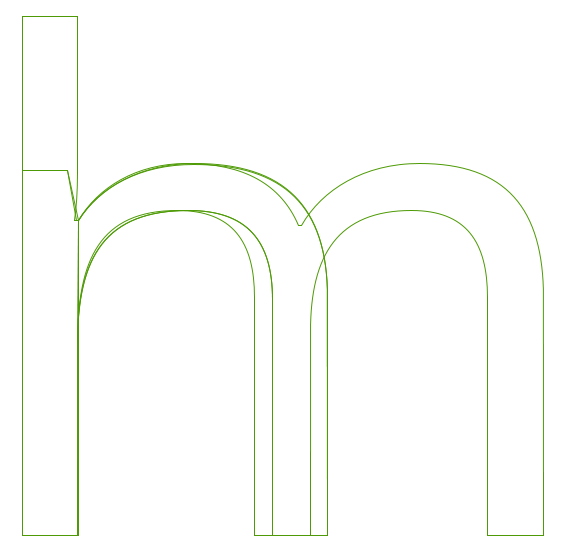
Designing The Lowercase ‘o’
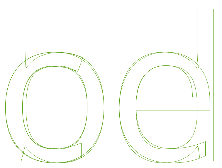
The design of the ‘o’ is not just a question of the black part of the letter. While the ‘o’ provides the very basic bowl weight and shape, the white — or counter — provides the size and shape used by the rest of the font. In general terms, we can also observe that the round form of the ‘o’ will be echoed in other characters. These include the b, c, d, e, p, and q, and the form will also implicate the shaping and forms of curves within any other characters of the font, such as the O, C, D, and Q.
In addition, the white inside the ‘o’ should be utilized when designing the spacing of our font; the ‘o’ sets up the reference rhythm of spaces used between all other glyphs in the font too. These two values are very related, so essentially you will need to design the amount of white space that are the side bearings of your ‘o’ as well. As a general principle, with the exception of slanted or italic fonts, the ‘o’ should have the same amount of space on the left and right sides, and the white space between a string of ‘o’ characters should balance the white space inside the ‘o’s.
Here we encroach well into the territory of spacing and metrics, so even at this early stage you may want to have a look at the “Spacing, Metrics, and Kerning” chapter, which covers the basic implications of spacing in a font. That should get you to a well-spaced ‘o’ character, which will help you with the design of the ‘n’.
Design The Lowercase ‘n’
Once you are happy with the form and spacing of your lowercase ‘o’ character as shown with a sample string, the next step of this approach is to create a suitably shaped, balanced, and well-spaced lowercase ‘n,’ which you will insert into your string of ‘o’s.
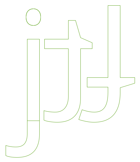
If we look at the anatomy of an ‘n’, we can break it apart into two or three components consisting of a stem and a curve. This approach can give us a shortcut to keeping balance and harmony within our characters as they are formed, and as our set of characters grows. Looking at the sample ‘n’ below; it is broken into two components. These separate components combine together to form an ‘n’, but the same components can be re-used later when forming other characters; e.g., the stem at the left of the ‘n’ can be used to form the left-sided stem of all other lowercase characters.
Taking yourself forward again to the chapter on “Spacing, Metrics, and Kerning”, the design of the ‘n’ character should keep pace with the process of spacing the ‘n’ and ‘o’ characters together.
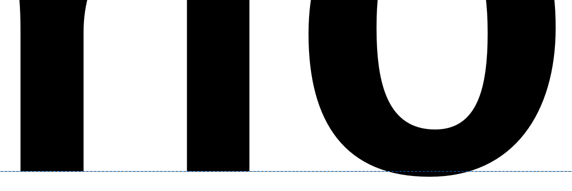
Now, garnering the methods you have used to create an ‘n’ and ‘o’ character, you are ready to expand the lowercase character set. The qualities of the stem and curve components of the ‘n’ and ‘o’ will inform the way you may form other characters. If we study the characters below from Open Sans, we can see the relationships between the formal aspects of separate characters and how they can be repeated, with some adjustments, to form the components of our font.