Line Spacing
When you have the word space and the ‘n’ and ‘o’ set, you can begin to look at the line spacing. However, a full and final decision about line spacing isn’t possible until you have capital letters and some punctuation.
Think about line space intentionally
As is the case with letter and word spacing, having too much or too little line spacing can make your font look awkward in real-world usage. Above all else, finding the right line spacing balance is a matter of thinking about the question intentionally and of testing a range of options on the way to making a final decision.
As a general rule, most new font designers tend to err on the side of having too little line spacing in their font, so if you are unsure, adding additional space is usually a good idea.
You should also consider the scope of your project’s language coverage when considering line spacing. If you test your font’s line spacing only with unaccented characters, you are likely to settle on a line spacing value that leaves no room for accents. If you are certain your font will never be used with accented characters, this might be acceptable — but the odds are that your font will be used to set accented text. In that case, too little line spacing will cause the accents on one line to run into the bottoms of the glyphs above, and leave the reader with difficult (if not impossible) to read text.
One strategy to test whether your font’s line spacing is proper for accented characters is to employ sample text from several languages.

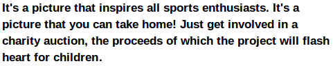
For languages heavy in diacritical marks (such as Czech), line spacing should be taller than for languages that use no diacriticals. The examples above show Czech (above) and English with the same fairly wide line spacing.
Experiment with your font’s line spacing in FontForge
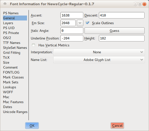
In FontForge, you can set and adjust your font project’s line spacing from within the Font Info window. Open this window by choosing Font Info from the “Element” menu, then click on the General tab. Note the values that FontForge has listed for Ascent and Descent. Unless you have made manual changes already, these two numbers when added together should equal the value of Em Size listed on the line below.
Now switch to the “OS/2” tab. On almost all computers, your font’s line spacing will be determined by the Ascent and Descent values that you enter in this tab, under the Metrics heading.
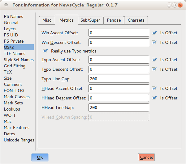
There are three sets of values: Win Ascent and Descent, Typo Ascent and Descent, and HHead Ascent and Descent. You should set all the Ascents to be the same as the Ascent value you noted in the General tab. Next, you should set all of the Descents to be the same as the Descent value you noted in the General tab, with one important exception: you must make the Typo Descent number negative. Leave the value the same, but put a minus sign in front of it. Finally, uncheck all of the “is offset” options.
These settings will give you a sensible starting point. You can now proceed to test your font with this line spacing and make incremental adjustments until you arrive at eye-pleasing result.
If you find your linespacing is too tight and you don’t want to or can’t make the vertical metrics larger, you can scale the glyphs down to gain more space for linespacing.