Spacing, Metrics and Kerning
The spaces between characters are an important, integral part of the design of a font.
Designing a font’s letter spacing should be carried out as an integral part of the whole process of designing a font. Good spacing is necessary for a font to function well.
In FontForge, the Metrics Window allows you to design the metrics of your font, alter the spacing between them, and test how glyphs look together. Metrics Windows can be opened from the ‘Window’ menu, or by using the Ctrl + K command.
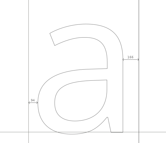
The space between any two glyph has two components: the space after the first glyph, and the space before the second glyph. These spaces between glyphs are composed of the ‘side bearings’ (left and right margins) from each glyph pair. Each glyph has a left side bearing and a right side bearing; in the example below of the lowercase ‘a’ of Open Sans, the right sidebearing has a value of 166 units, and the left sidebearing has a value of 94 units.
Basic Functions Of The Metrics Window
The side bearings of characters can be edited in FontForge’s Metrics Window in five ways:
- Manually dragging each side bearing boundary.
- Manually dragging a character. Note though that dragging a character will only effect the value of the left side bearing.
- Directly editing their value in the metrics tables of the Metrics Window.
- Incremented / decremented by using the keyboard.
- Using commands in the Metrics Window’s Metrics menu.
Adjusting Side Bearing Values With The Keyboard
One method of adjusting metric values quickly and accurately in FontForge is by using the up, down, left and right keys of a keyboard. The up and down keys are used to increment / decrement values and Alt + Up, Alt + Down, Alt + Left and Alt + Right are used for navigating around the different value fields of the Metrics Window.
General Principles
As a general principle, symmetric characters such as ‘A’ ‘H’ ‘I’ ‘M’ ‘N’ ‘O’ ‘T’ ‘U’ ‘V’ ‘W’ ‘X’ ‘Y’ ‘o’ ‘v’ ‘w’ ‘x’ will have symmetric side bearings. For example, the left and right side bearings of an ‘H’ will be the same value. Note though that this is not a hard and fast rule, but a general one.
【Note】: This rule is also mentioned in Creating the letters 'o' and 'n'.
As you space the characters that you design, you should trust your eyes. The bottom line is to ‘design, look, adjust, look again’.
For the absolute beginner, do not assume that reliable results are achieved by relying on the measured space. For example, whilst the measurements between two characters may be unequal, the eye can see them as equal. An obvious example of this can be seen when attempting to space the characters ‘H’ and ‘O’. So for the example below, the side bearings of the ‘H’ and ‘O’ are equal, but look unequal. In the lower line, the side bearings are not equal but the spacing appears balanced.


Metrics Menu Commands For Editing Metrics
“Center in Width” — This centers the current glyph within its current width.
“Window Type” — FontForge’s Metrics Window can be set to behave in two ways for metrics adjustment;
- “Advance Width Only” — in this mode metrics view may only be used to adjust the advance widths of glyphs.
- “Both” — In this mode metrics view will adjust either the advance width or kerning values.
“Set Width” — this command allows you to change the width of the current glyph.
“Set LBearing” — allows you to change the left side bearing value.
“Set RBearing” — allows you to change the right side bearing value.
A Basic Approach To Spacing
The following method is designed to get you started effectively towards designing the metrics of your font.
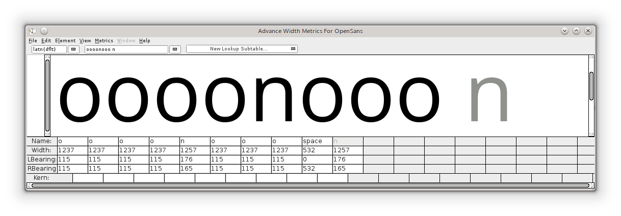
Starting with a string of lowercase ‘o’ characters in the metrics window, the left and right sidebearings can be adjusted until the spacing of the characters looks and feels right. One way to look for this ‘rightness’ is to look for the whitespace between the ‘o’ characters to balance the whitespace inside the ‘o’ characters. In general, with the exception of slanted or italic fonts, the left and right side bearings of a lowercase ‘o’ should be of equal value. Once you are happy with the spacing of your string of ‘o’ characters, introduce the ‘n’ character from your font (see below) and then look to adjust the side bearings of the ‘n’ so that its spacing fits into the balance of the string of ‘o’ characters (see below). Note that due to the nature of the way our eyes see, the right side bearing of an ‘n’ will always be a smaller value than the left side bearing, and the side bearings of the ‘o’ will be smaller than the side bearings of the ‘n’.
Once both the ‘n’ and ‘o’ are adequately spaced, their sidebearings can be used to create the sidebearings for an array of other characters: for example:
- The left side bearing of the ‘o’ can be used for the left side bearing of the ‘c’, ‘d’, ‘e’, and ‘q’.
- The right side bearing of the ‘o’ can be used for the right side bearing of the ‘b’ and ‘p’.
- The right side bearing of the ‘n’ can be used for the right side bearing of the ‘h’ and ‘m’.
- The left side bearing of the ‘n’ can be used for the left side bearing of the ‘b’, ‘h’, ‘k’, ‘m’, ‘p’ and ‘r’.
【Note】: the above should be used as a guide only that can be used as a super effective starting point for finding correct values for these side bearings.
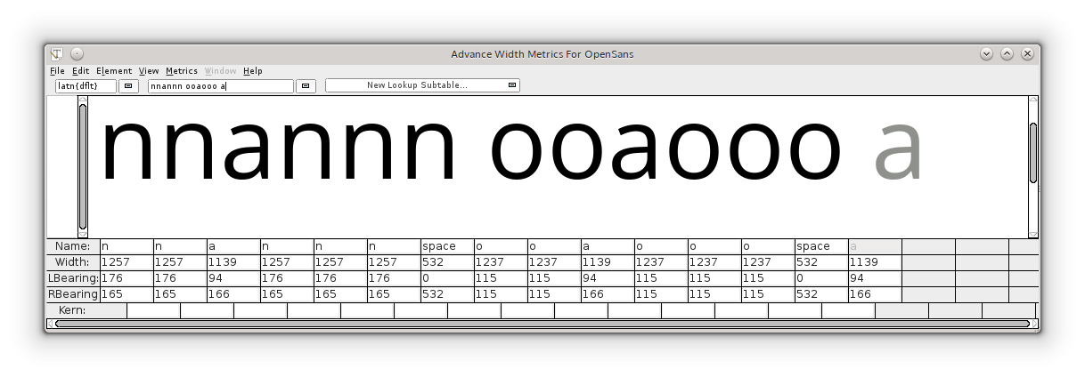
From here it makes sense to then space the rest of the side bearings of the lowercase characters against strings of ‘n’ and ‘o’ characters, as seen in the diagram above. Again, trust your eyes to reach correct balance of characters.
Uppercase Characters
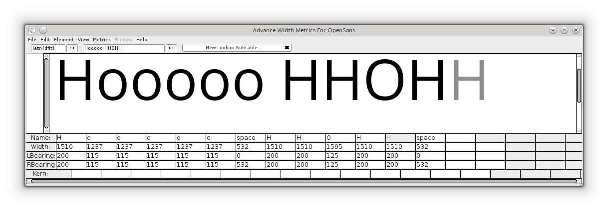
Uppercase characters can be spaced using the same principles as above. For example, start with the string ‘Hooooo’ and adjust the right side bearing of the ‘H’ until it feels balanced against the string of ‘o’ characters. With the left side bearing of the ‘H’ being equal to the right side bearing, the uppercase ‘O’ can then be spaced against the ‘H’ (see below).
From here all other characters can be spaced against the characters which have already been spaced. It should be noted that this method can be used as a good starting point for spacing a font, but it is likely that more minute fine-tuning of spacing will also be needed to achieve higher levels of good letter spacing. Other strings of characters that are useful in this can be arrays such as ‘naxna’, ‘auxua’, ‘noxno’, and ‘Hxndo’.
Kerning
Kerning is the adjustment of the spacing between specific character pairs. Kerning enables individual spacing of character pairs that is applied in addition to the spacing provided by a character’s side bearings. Common examples of character pairs where kerning is often needed to improve spacing would be ‘WA’, ‘Wa’, ‘To’, and ‘Av’. In the examples below, we can see that, without kerning, the spacing between the letter pairs ‘To’ and ‘Av’ are too wide, whereas, with kerning, the space between these character pairs is much more balanced with the feel of the spacing of the rest of the font.


The Metrics Window in FontForge can be used to design both side bearings and kerning values. Kerning values can be applied to a font in a number of ways in FontForge. Two of these are shown below: kerning with classes and kerning with individual pairs.
FontForge’s Metrics Menu
“Window Type” — FontForge’s Metrics window can be set to behave in two different ways to enable kerning adjustment:
- “Kerning Only” — In this mode the metrics view may only be used to adjust kerning.
- “Both” — In this mode metrics view will adjust either the advance width or kerning values.
“Kern By Classes” — This command provides the user with a dialog to manipulate kerning classes.
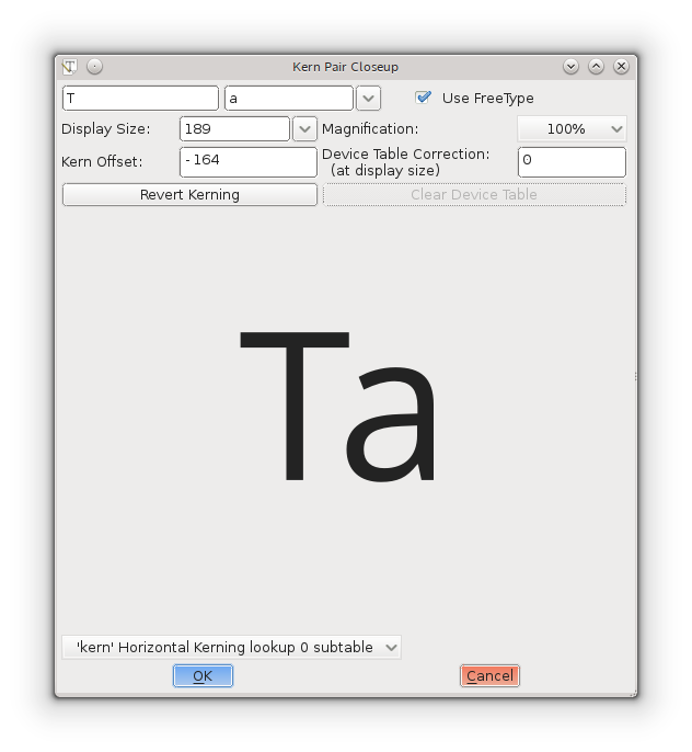
“Kern Pair Closeup” — This command provides the user with a dialog from which you can adjust already existing kerned pairs or create new pairs (see below).
Adjusting Kerning Values With The Keyboard
Just like with adjusting side bearing values, kerning values can be quickly and accurately edited in FontForge by using the Up, Down, Left and Right keys of a keyboard. The Up and Down keys are used to incrememt / decrement values and Alt + Up, Alt + Down, Alt + Left and Alt + Right are used for navigating around the different value fields of the metrics window.
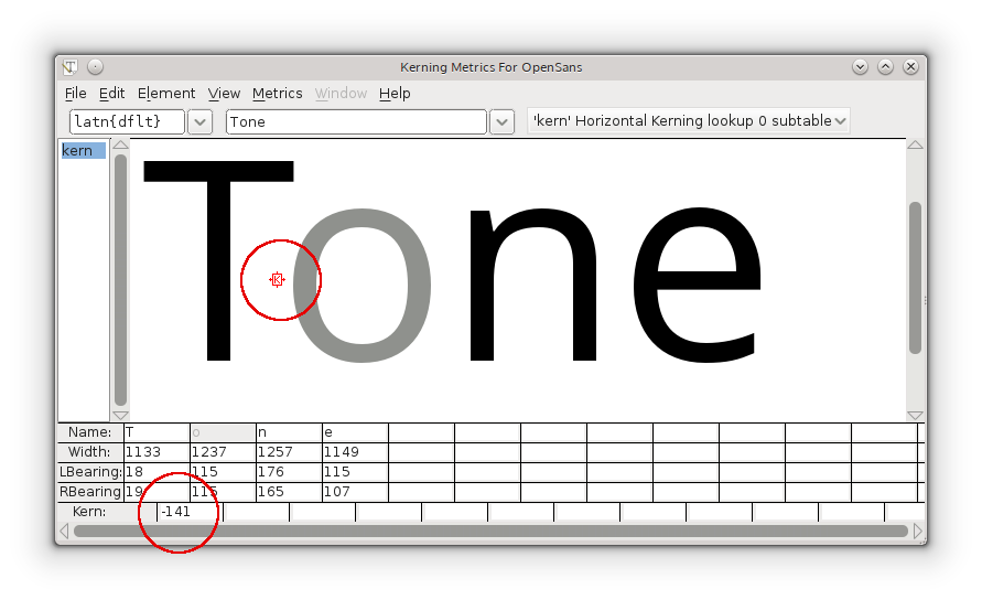
Kerning Individual Pairs
This is the most basic level of creating kerning pairs in FontForge. In the Metrics Window, the kerning value between two characters can be manually adjusted either by dragging the right-hand character to or from the left-hand character, or by editing the kerning value directly in the metrics table of the window. To change kerning values by dragging characters, use the kern-tool handle that appears when the mouse cursor is hovering between two characters (see screenshot below). The kerning value in the metrics table can be edited by manually entering values or by incrementing / decrementing the value using your keyboard’s Up / Down keys.
Kerning With Classes
Class kerning can save you a lot of time!
A ‘kern class’ in FontForge can be created to build groups of characters who will all have the same kerning value applied. For example, a class can be created — let’s call it ‘o_left_bowl’ — in which the characters ‘o’, ‘c’, ‘d’, ‘e’, ‘q’ will always have the same kerning value when preceded by, for example, the character ‘T’. The ‘T’ could also itself be a member of another class that would likely include other characters such as Tcaron and Tbar.
Class Kerning is one kind of GPOS lookup. This kerning information is found by going to “Element ⇨ Font Info”, and then “Lookups”, and then selecting the “GPOS” tab. (You can do this any time to get back to where you left off.)
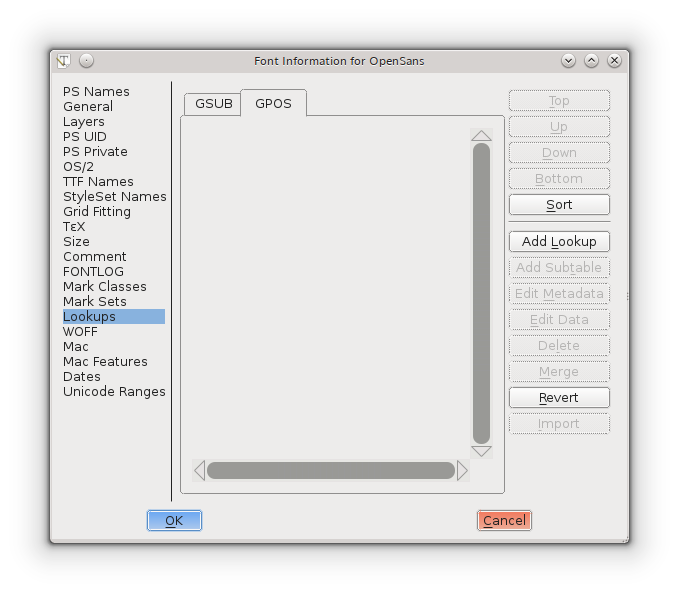
Hit the “Add Lookup” button, and choose Type: “Pair Position (Kerning)”
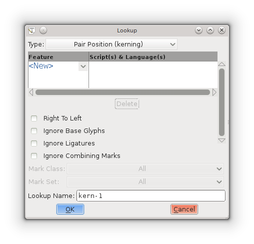
Do NOT click “<New>” button; click the “🔽” arrow next to it, and select “Horizontal Kerning”. You will notice that “<New>” will change to “<Kern>”. Accept the default Lookup Name, or change it if you wish, and hit the “OK” button.
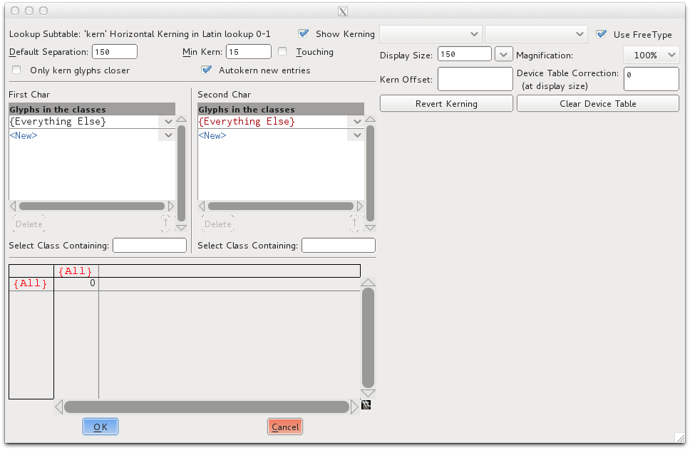
You return to the “GPOS” tab, and you now have a lookup table that is selected. Each set of kerning classes lives in its own subtable. To create a subtable, hit the “Add Subtable” button. You can “OK” the default name.
Then you are shown a window with a lot of choices:
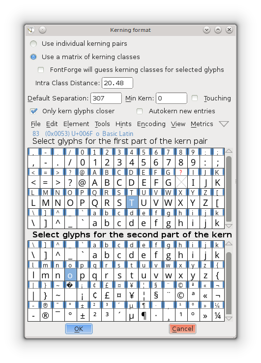
At the top you are asked to choose either “Use individual kerning pairs” or “Use a matrix of kerning classes”.
If you chose classes you will be presented with a following dialog where you can create your classes. If you want to kern references along with the originals, choose classes.
Note that you can choose to enable FontForge to ‘guess’ or ‘autokern’ the kerning values between the classes you are creating in the dialog. If using FontForge to guess kerning values, you will undoubtedly need an amount of trial and error and experimentation, but it can make sense to use the autokern function as a quick way to kern your font and see what improvements this can bring.
Leave the rest of the parameters as they are until you have reason to try different values.
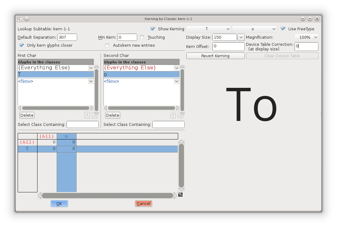
After clicking “OK” in the above dialog, you will be presented with the following window where you can fine-tune the amount of kerning between these two classes. For example in the second screenshot below, two classes have been created, one class containing the ‘T’ character, and one class containing the ‘o’ character.
You can select all the glyphs and delete classes later, or you can select only the glyphs you want to kern. You select all the glyphs you want to adjust at the same time, and FontForge will put them in classes — unless you’re working with different writing systems that you don’t want to kern together (like Latin, Greek, Cyrillic…).
When you hit the “OK” button, you get a big window with some parameters on top, two lists of classes, and a matrix below. When you select a box in the matrix, you can see how the pair is kerned. If you don’t like it, you can adjust the Kern Offset, in the box above the display of the glyph pair.
If anything screwy happens, and it will, hit the “Cancel” button. Then double-click the subtable (hit the plus sign next to the table if you don’t see it) and you’re back in the big window. If you do a lot of work without trouble it’s a good idea to hit “OK” and come back, so you don’t lose your work when something screwy happens.
The metrics window can be used later as a final check. While making adjustments in that window can be done, it keeps asking if you want to kern the class or the pair and picky stuff like that. Why not try it and see if you like it? But know that some experienced users don’t like it, and do all kerning as above: “Element ⇨ Font Info”, and then “Lookups”, and then selecting the “GPOS” tab, expand by hitting the + sign, double-click the subtable.
Manual Kerning
If autokerned values need to be adjusted (and they will!) then this can be done in a number of ways.
- Via the ‘kerning by classes’ dialog window.
- Using the Metrics Window.
- Using the ‘Kern Pair Closeup’ command from the Metrics menu.