Designing Devanagari Typefaces
Thanks to Adam Twardoch, Erin McLaughlin, Neelakash Kshetrimayum, Dan Reynolds, Pooja Saxena, Dr Girish Dalvi for contributing many of the ideas on this page.
Designing a new and original Devanagari typeface follows a process much like the process for a new and original Latin. The unique benefit of libre in libre fonts is that you can modify and reuse them for new purposes that their initial creators never thought of — for example, designing a Devanagari and adapting an existing Latin font to go with it.
Devanagari Glyphs
Devanagari fonts contain these different types of glyphs:
- consonants (36)
- independent vowels (28)
- vowel maatras
- word space(s)
- Devanagari numerals (10)
- Latin numerals (new, or if already present then adjusted to work within pure Devanagari text)
- nukta composites
- half-forms
- conjuncts (unique ligature glyphs)
- “I” vowel maatras of differing lengths
- Devanagari punctuation, marks, and symbols
- Latin punctuation, marks, and symbols (new, or adjusted if already present)
- Latin letters
Consult the Unicode Chapter 12 on Indian Scripts (Devanagari Unicode page), as well as the Microsoft Devanagari OpenType Font Development page to learn more about these glyphs and how the Indic shaping engine works.
It is helpful to do some calligraphy or closely study writing manuals to learn how the script works, so you understand which letters should be like which other letters in structure. These two pages from Aksharaya’s Devanagari Calligraphy Manual can be used as a reference for pen angle and letter proportions.
What to Do First
When designing a Devanagari and Latin typeface, it’s important to start by draw the Latin alongside the Devanagari. In the earliest stages are designing the “key” glyphs, to establish the personality of the typeface through fundamental shapes and spacing (which in Latin may be ‘adhesion’ or ‘videospan’.) Design the lowest and highest “height extremes” glyphs early in the process.
You’ll need plenty of vowel signs to begin testing texture and scale.
The professor of typography at IIT Bombay, Dr. Girish Dalvi, wrote in his PhD thesis,
Through the results of this study we can deduce that the ten letters अ इ ए ख त भ द ध थ ष can almost capture all the formal properties of remaining Devanagari letters. Within these letters the letters अ इ ख भ द ध ष are most critical as they define features for the majority of the letters. We can hence suggest that by designing these letters first; the process of Devanagari font design can be simplified for students well as type designers as the remaining letters can be derived from these ones.
Erin McLaughlin suggested these glyphs as an initial progression: पाव + किमीनुफू + भरसगदह + र्मों ड्डू (height extremes) + यथधआछड … continue character set and suggested to focus on the “Au” vowel sign + reph + anusvara combo!, the Ma is just there for posterity.
The height extremes glyphs allow you to determine the vertical metrics, and how to scale the two writing systems to work together. Adobe publishes very large type families that cover very different orthographies. These are split into families with shared general proportions: Myriad Pro has Latin, Greek and Cyrillic, but the Hebrew and Arabic designs are packaged as separate families which include modified Latin designs.
Here is Myriad Pro Latin and Myriad Arabic juxtaposed:
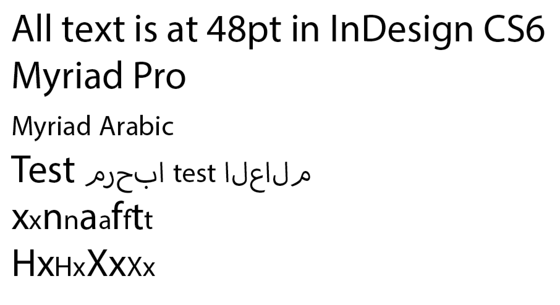
(Spot Adobe’s designers neat decision: the cap height of the Latin in Myriad Arabic is the x height of the Myriad Pro Latin.)
Note that in the Lohit character set, the lowest glyphs are forms, meant to go below characters that descend very far below the baseline:
(Vattu is the below-base form of reph. See the Microsoft terminology page for more details.)
Ideally, these should stack below your lowest vertically-stacking conjunct, like the example on the left (Lohit, which doesn’t quite vertically fit, is on the right):
Spacing approach
Designing Latin fonts typically involves a series of spacing strings like this,
HHxHOHOxOO
nnXnonoXoo
where the X represents the letter you are focused on spacing, and the concept is looking at this letter next to a somewhat flat-sided character and a round character.
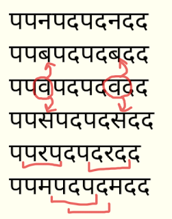
Pa, and Va or Da are Devanagari equivalents:
पपXपवपवXवव
पपXपदपदXदद
When just beginning a project, start with filling a page entirely with Pa in order to get the right balance of stroke thickness, counter size, and spacing.
पपपपपपपपपपपपपपपपपपपपप
Once the Pa has the right “color”, you can begin adding these other basic, common characters:
पपपवपपपपपवपववपपव (va, randomized)
पपपापपपपापपाप (Aa maatra, randomized)
पपपदपपपपपदपददपपद (da, randomized)
Then, you can begin using the spacing strings shown above, in order to add more glyphs:
पपरपदपदरदद
पपकपदपदकदद
पपलपदपदलदद
पपपीपदपदपीदद
and so on!
You’ll want to look at these in a long list like that, so you can compare from one glyph to another, as you scroll downward — both on screen and in print. Doing a vertical check is more effective than just a long line of continuous text. Here’s why:
When you look at the spacing strings in vertical columns, you can easily compare the spacing with the lines previously above and below the current character. In the same way that we can easily recognize “rivers” in badly-set full-justified text, it will be easier to see white gaps or dark spots in spacing if you are comparing against a spacing string that remains constant.
The spacing string above allows you to compare very disparate shapes, so that spacing is more even throughout (instead of all of the round characters being too loose or too tight)
And the four glyphs in the middle, Pa/Da/Pa/Da allow you to compare the tested character against two sets of three, if you just look at Pa/Da/Pa or Da/Pa/Da.
After drawing and spacing a handful of vowels and consonants, you’ll be able to make a limited number of words with only those letters, and begin testing your design with real text.
Work Breakdown Structure
In any typeface design project, its a great idea to sketch out a Work Breakdown Structure.
For someone very experienced, it is possible to design the initial light and bold weights of a Devanagari typeface in around 4–6 months.
Here is a sample schedule for an interpolated family of 9 weights, upright and slanted, of a somewhat simple ‘sans’ design, by a very experienced designer:
| Week | Goal | Glyphs |
|---|---|---|
| 1 | Establish design in 7–10 key glyphs | 10 |
| 2 | Refine, design tallest glyphs, match heights and weights to Latin in regular & bold, test screen rendering with ttfautohint | 20 |
| 3 | Refine proportions with native reader feedback | 40 |
| 4 | Get native reader feedback, refine and add more conjuncts | 100 |
| 5 | Get native reader feedback, refine and add more conjuncts | 200 |
| 6 | Get native reader feedback, refine and add more conjuncts | 300 |
| 7 | Get native reader feedback, refine and add more conjuncts | 400 |
| 8 | Get native reader feedback, refine and add more conjuncts | 500 |
| 9 | Get native reader feedback, refine and add more conjuncts | 600 |
| 10 | Get native reader feedback, refine and add more conjuncts | 700 |
| 11 | Get native reader feedback, refine and add more conjuncts | 800 |
| 12 | Get native reader feedback, refine and add more conjuncts | 900 |
| 13 | Derive bold | 1,800 |
| 14 | Refinements, kerning, testing with native reader feedback | 1,800 |
| 15 | Extrapolation and clean-up of thin and black weights, generation and clean-up of slanted styles | 3,600 |
| 16 | Interpolated styles refinement | 3,600 |
| 17 | General refinement of spacing, kerning & testing in all styles | 3,600 |
| 18 | Finalization | 3,600 |
You may want to work with a font that has no sources available, only binary OpenType GPOS/GSUB tables. There are a few tools that can convert those into the Adobe FEA syntax, including FontForge, but the output of each tool will require reworking by hand.
The Adobe FDK contains a ‘spot’ tool, that can be used like this:
spot -t GSUB=7 Font.otf > GSUB.fea
The Noto project has a dump_otl.py
The ‘Fontlab Studio’ and ‘OpenType Master’ proprietary application have converters too.
Useful Resources
Introductions
Where to look for inspiration and ideas
Look at the Devanagari fonts by the Indian Type Foundry, and those that were just released through Google Fonts, for inspiration on the variation of letter shapes.
Another good place to search for Hindi “e-paper” newspaper sites to see actual fonts-in-use — advertisements usually have more diversity in fonts. Jagran is a very largely circulated Indian e-paper.
Flickr is also a good source of ideas for imagery:
Historical sources
Get your hands on copies of Introduction to the Devanagari Script by H. M. Lambert, Oxford University Press 1953 and Typography of Devanagari (three volumes) by B. S. Naik, Directorate of Languages, Bombay 1971.
Beyond that, there are at least two general sources of 19th century type from Europe worth looking at: the typefaces from Britain and those from Germany (mostly from Leipzig). These types were used more for the setting of Sanskrit texts than for Hindi texts.
Do also try to find samples of 19th and 20th c. text typefaces from Indian type foundries. They are significantly less Europeanized, as you might expect. There is wonky stuff going on in European academic Sanskritic faces from the 19th century that doesn’t seem to appear in 20th century Indian typography at all. These Indian sources are probably more difficult to find in Western libraries, but perhaps Erin McLaughlin has more leads. Matthew Carter’s 1970s Linotype Devanagari is based on typefaces from the Nirnaya Sagar foundry, for instance. Samples of their types, and the Bombay Type Foundry’s types, should be accessible in some western university and/or national libraries. It would also be worth looking at Monotype’s Devanagari and Linotype Devanagari (the 1970s version and 1980/90s update, not the original 1935 one, which only bore the same name).
There is no Devanagari type in Typefounders in The Netherlands (Charles Enschede, Harry Carter 1978). Whatever you do, don’t look at Bodoni’s types from his 1818 manual.
Some German-made Devanagari type from H. Berthold AG may be seen in Alphabete und Schriftzeichen des Morgen- und des Abendlandes, from the Reichsdruckerei, Berlin 1924, p. 45–47.
Articles
- Sarang Kulkarni wrote “Issues with Devanagari Display Type (PDF)”.
- Yashodeep Gholap wrote Designing a Devanāgarī text font for newspaper use (PDF).
- Vaibhav Singh’s MATD disertation, Devanagari in multi-script typography.
Lohit2 Devanagari
Lohit2 Devanagari can be used as a base for new OFL fonts by using its Glyph List and OpenType Layout code. It is available as original FontForge sources or as a UFO zip download.
OpenType Layout
Devanagari Anatomy
- TDIL Devanagari Script Grammar (PDF).
- Two pages from Aksharaya’s Devanagari Calligraphy Manual, which can be used as a reference for pen angle and letter proportions.
- Professor Girish Davli of IIT Bombay IDC (comparable to the USA’s MIT Media Lab) published this Devanagari Anatomy article (PDF).
If you’re new to Devanagari script, it’s important to become aware of traditional calligraphic pen stress, which is different than in Latin. Here’s a quick demonstration of the stroke angle, and how curves were traditionally weighted. Your design will be more successful, and appear less “Latinized”, if you draw your curves according to these weight principles, rather than cutting-and-pasting Latin alphabet letter parts.
The Devanagari Unicode page shows the basic letters, but not the conjuncts.
Testing Tools
Adobe InDesign’s support for OpenType Fonts for non-European scripts only became reliable with Creative Cloud, and the World Ready Composer paragraph option must be enabled; even the latest version can be improved. The libre harfbuzz and Microsoft OpenType implementations are the most complete, so you should test your fonts in the latest versions of Chrome, Firefox and Microsoft Word, on both Windows and Mac OS X, to ensure errors in shaping are due to the fonts and not the underlying engine.
Pablo Impallari’s Devanagari Testing Page (with sources on GitHub!) provides some ready-made testing layouts, and you can drag and drop your OTF or TTF right into the page to load it.
Pooja Saxena’s Type Tools (with sources on GitHub!) generates test texts for letter combinations.
The Adhesion Text Devanagari is a special version of the a tool built by Miguel Sousa to make dummy text comprised only of the words possible to write with the glyphs you have already drawn. Insert the glyphs (अआईईउऊ etc) that you’ve drawn, and out will come some sample words for you to use in proofs.
The Huerta Tipografica’s Devanaguide is an open source tool to see and compare different devanagari fonts. It also allows you to type a text and preview it in all the fonts at the same time. The Devanaguide also includes a Devanagari word list which is helpful for test text design.
Other Links
Books & References for Devanagari typography Projects is a list of resources which will probably fulfill most of the research requirements of most projects. Compiled by Professor Girish Davli of IIT Bombay IDC.
Forum Discussions
Typophile
Google Fonts Directory Discuss